
Why Your Colored QR Code Won't Scan: Contrast Fixes & Design Mistakes
The Most Common Problem with Custom QR Codes is Not the Color, But the Contrast
May 13, 2024 | By QR Code Free Team
Customizing your QR code with brand colors is a smart way to maintain aesthetic consistency. However, moving away from the default black-and-white introduces a huge risk: **scannability failure.**
If your colored QR code won't scan, the problem is almost always due to **poor color contrast** or **inversion**. Since smartphone cameras and scanner apps rely on binary (black or white) recognition, any combination that confuses this light-dark pattern will result in a failed scan.
The Golden Rule: Dark Foreground on a Light Background
The cardinal rule of QR code design is non-negotiable: **The QR code pattern (foreground) must be significantly darker than its background.**
Why? Scanners are engineered to detect a distinct change from light to dark. If the difference is too subtle, the scanner cannot differentiate between the data modules and the surrounding background. This is where subtle or pastel colors often fail, even if they look clear to the human eye.
The Minimum Contrast Ratio
To be universally scannable, a QR code should meet a minimum contrast ratio of **4:1** (foreground to background), as recommended by accessibility guidelines (WCAG) for non-text graphics. Black on white is 21:1—the maximum contrast possible.
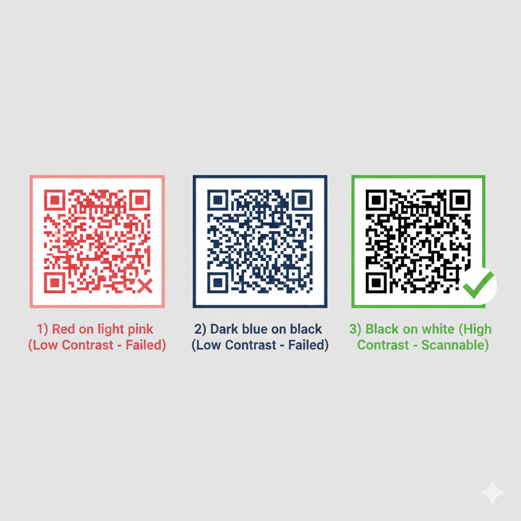
Example of color combinations: Low contrast (Red/Pink, Dark Blue/Black) will fail. High contrast (Black/White) will succeed reliably.
Mistake #1: Inverted Colors (Light on Dark)
Many users attempt to create a code that is **white on a black background** (or light blue on dark blue). While this looks striking, it is the single most common reason for scanning failure.
Most basic QR scanning technology and older mobile cameras are optimized to read the standard dark-on-light pattern. When you invert the colors, these scanners struggle to identify the finder patterns and decode the data, leading to a frustrating user experience.
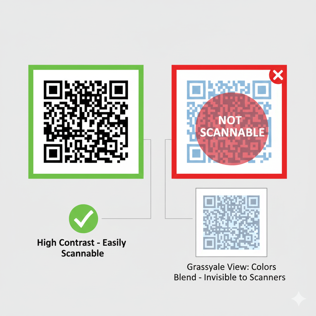
When converted to grayscale, low-contrast colors (like light blue on a darker blue) blend together, making it impossible for scanners to read the data pattern.
Mistake #2: Environmental Factors and Lighting
Even a perfectly designed code can fail if placed in the wrong location. Scannability is not just about the code itself; it's about the interaction between the code, the light, and the scanner.
Common Environmental Issues:
- **Low or Dim Lighting:** Insufficient light reduces the camera's ability to pick up the contrast between your colors.
- **Glare and Reflection:** If the code is printed on glossy paper, placed behind a glass frame, or laminated, glare from light sources can completely wash out the pattern.
- **Curved Surfaces:** Placing the code on a bottle or curved packaging can distort the pattern, making it unreadable.
If you must place your QR code in a potentially dim area, like a bar menu or a nighttime event poster, prioritize maximum contrast (Black on White) to provide the scanner with the clearest possible image.
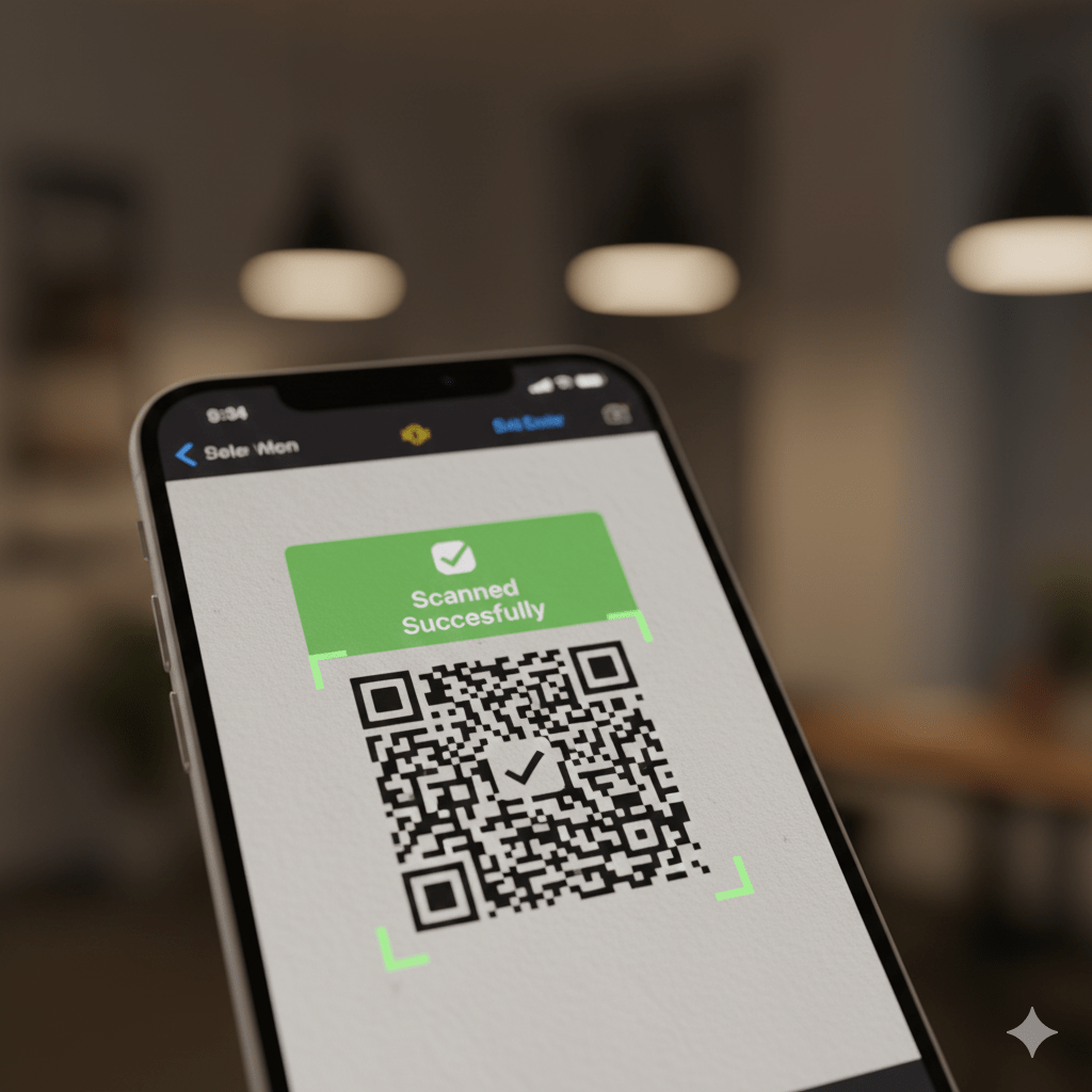
High contrast allows for successful scanning even when lighting is not ideal, ensuring a reliable user experience.
Quick Fix Checklist: Make Your Colored Code Scannable
- **Check Contrast:** Use a color contrast tool to ensure your foreground color is at least **4x darker** than your background color.
- **Flip the Colors:** If your code is light on dark, **invert the colors** immediately so the code pattern is dark and the background is light.
- **Avoid Pastels:** Steer clear of light, low-saturation colors (pale yellow, light gray, soft pink) on a white background.
- **Print Matte:** If printing, always choose a **matte finish** over glossy to eliminate reflective glare.
- **Test Thoroughly:** Test the final printed or displayed code using multiple devices (iOS and Android) and in the environment where it will be used.
Ready to create a vibrant, scannable code? Head back to our generator and confidently choose your colors using the Dark on Light rule!

